Stop Using Pie-Charts

Table of Contents
What’s Wrong With Pie Charts
Humans have a hard time comparing areas. Try it for yourself: Which slice is the largest? Which is the smallest?

Instead, if we plot the exact data points in a linear dimension; it’s trivial:

Alternatively, we can plot it horizontally using a lollipop-chart.

This article shows failures of pie charts, and provides some alternative plots (and matplotlib code) to use in their place.
Research Shows Humans Have a Hard Time Visualizing Area
Prior research exists showing humans have an easier time comparing linear data rather than multidimensional areas.
Stevens’ Power Law
In 1957 psychologist Stanley Smith Stevens published a body of work which went on to be named the Stevens’ Power Law. The law describes how people perceive intensities of various stimuli relative to other stimuli. It showed that people, on average, tend to perceive an actual 100% growth in area as being approximately 60% bigger.
Cleveland and McGill
In 1984, Cleveland and McGill published experimental results evaluating various data visualization types. They too showed that interrupting linear-based data visualizations was less error-prone when compared to visualizations that used angles or area.
Still Think You Are Above Average and Can Read a Pie-Chart?
Then consider picking up a copy of illusion. It’s a card game where players must rank cards based on the visible area of a particular color.

On your turn you must either:
- draw and place a new card in the correct order, or
- claim that the current order of ranked cards is incorrect.
If you claim the order is incorrect, you flip all the cards to reveal the actual area, and if it’s incorrect the previous player must take all the cards; however, if you are incorrect and it is in ascending order, then you take all the cards. The player with the least amount of cards wins.
Visualizing Real-World Data

In this section, we will switch from using randomly-generated data to using precipitation data, which was previously described in “Plotting Precipitation with Python, Pandas and Matplotlib”; in particular Victoria BC’s daily precipitation for 2021. Let’s See if it actually rains more on the weekend.

Saturday, Sunday, and Monday appear to be equal; however, it’s not possible to see which day received the most rain.
Let’s Try That Again
Here’s the same data plotted horizontally:

Ah ha! Saturday was the wettest day, followed by Sunday. It turns out that Monday is actually halfway between Thursday and Saturday – something that was not clearly displayed by the pie chart.
Introduction to Box and Whisker Plots
Before plotting the precipitation data, let’s quickly talk about box-and-whisker plots (or box plots for short).
First let’s take a random sample of 100 normally-distributed data points centered at 0.0, plus an additional outlier value of 10.
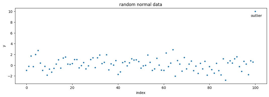
The data appears to be contained within -3.0 and 3.0, with the exception of the outlier. This should not be a surprise as the data is normal, and a normal distribution must contain 99.73% of data within three standard deviations.
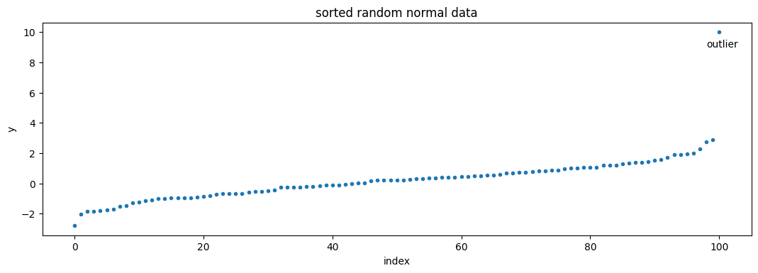
If we first sort the data before plotting it, it’s easier to see the range:
We can then break this data up into the lowest 25 percent, the middle 50 percent, and the highest 25 percent of data:
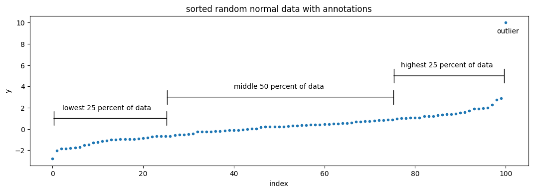
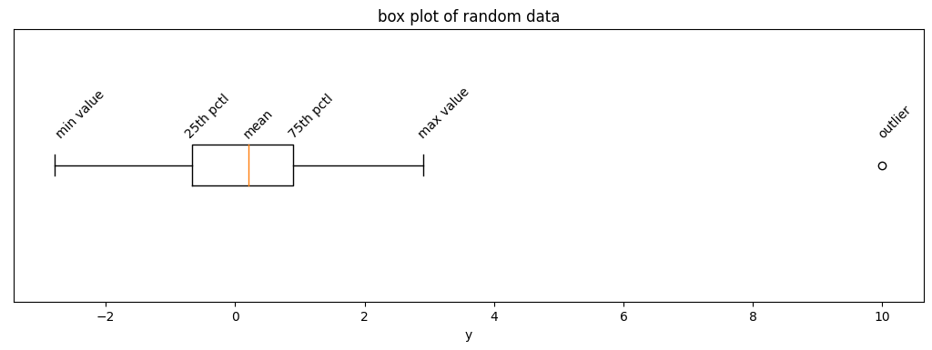
These percentiles are the core of a box-and-whisker plot. The plot is comprised of four parts:
- a rectangular box displays the lower and upper quartiles (the 25th and 75th percentiles),
- a vertical line drawn inside the rectangular box, which represents the median value (the 50th percentile),
- whiskers which extend on beyond the rectangle to display the minimum and maximum values, and optionally
- outliers which are displayed as points which were rejected while calculating the percentiles.
Box Plot of Precipitation Data
Let’s get back to our real-world data, and use a box plot to view the rough distribution of precipitation for each day:

It turns out that the heaviest day of rain in 2021 occurred on a Monday! That Monday was November 15th, when BC was hit by an atmospheric river, which caused severe flooding and severed all roads in and out of Vancouver. Victoria only received 78mm of rain, compared to Hope, BC which received 103mm (and 174mm on the prior day), but I digress.
It’s possible to reduce (or completely disable) outlier detection, by setting a very large whis value; however doing presents a simplified version of the story:

Plotting Percentages
The box plots might be too complicated for some cases (or audiences), let’s return to using a lollipop chart.
Plotting the Number of Wet Days in a Year
If you have the option of staying inside, does 50mm vs 80mm of precipitation really matter? Instead of plotting total precipitation for each day of the week, instead we will count the total number of days that rained during the year (149!), and plot the percentage of those rainy days based on the day of the week:
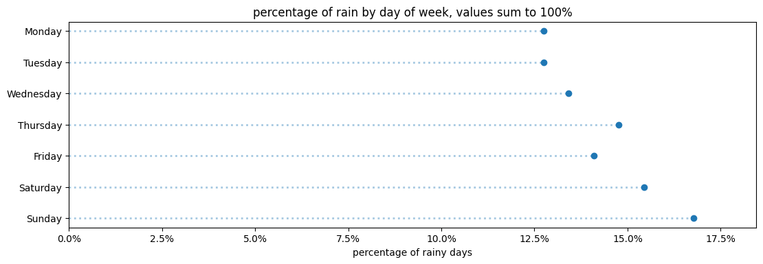
Note the above title states that all “values sum to 100%”, that’s an easy way to communicate that your visualization shows a complete picture of all the percentages as you would typically find in a pie chart.
Waffle Charts
If you absolutely want to show an area-based chart, consider using a 10x10 waffle chart. The 10x10 suggestion allows users to treat each box as a percentage point, which they can count if they want.
Here’s an example where days have been plotted from most to least precipitation.
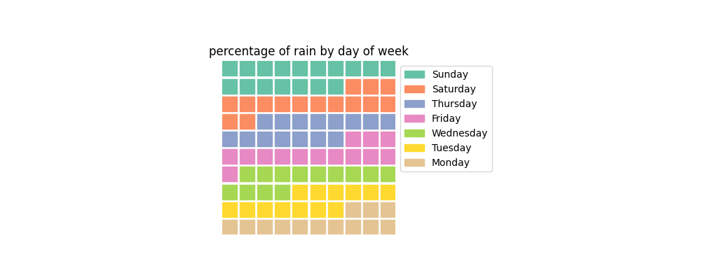
This chart feels like a step backwards from the previous lollipop charts. It’s no longer obvious which day was the rainiest – Sunday has 17 squares (percent), where as Saturday has 15 squares. It’s not obvious without having to count the squares – yes, you could add labels to the plot, but at this point you might as well just display a table instead.
While waffle charts might sound tasty, they still rely on area, which humans have a hard time perceiving changes in. Ultimately it’s best to keep your waffles with your pies – in the kitchen.
Generating Horizontal Charts Using Python and Matplotlib
The following section provides some sample python and matplotlib code to help you get started.
Random Data
First, let’s generate some random data. In particular the data will be positive values randomly distributed along a log-normal curve. Alternatively the absolute value of a Gaussian curve could have been used.
import matplotlib.pyplot as plt
import random

phonetics = [
    "alpha","bravo","charlie","delta","echo","foxtrot","golf","hotel",
    "india","juliet","kilo","lima","mike","november","oscar","papa",
    "quebec","romeo","sierra","tango","uniform","victor","whiskey",
    "x-ray","yankee","zulu"]

def get_random_data(num_data=5, mu=1, sigma=0.1):
    if not (0 < num_data <= len(phonetics)):
        raise ValueError(num_data)
    data = [random.lognormvariate(mu, sigma) for _ in range(num_data)]
    labels = list(phonetics[:len(data)])
    return data, labels
Calling print(get_random_data(5)), will result in a tuple containing a list of 5 random values, along with a list of 5 labels:
(
  [2.3830, 2.3067, 2.7829, 2.8205, 2.7673],
  ['alpha', 'bravo', 'charlie', 'delta', 'echo']
)
Generating a Horizontal Plot
The following will save the plot to the current directory under horizontal-bar-chart.png.
def plot_horizontal_bar(data, labels, output_path, xlabel=None, title=None):
    fig = plt.figure(figsize=(10.0, 5.0), dpi=100)
    ax = fig.add_axes([0,0,1,1])
    ax.barh(labels, data, height=0.1)
    ax.set_title(title)
    ax.set_xlabel(xlabel)
    fig.savefig(output_path, bbox_inches='tight')

data, labels = get_random_data()
plot_horizontal_bar(data, labels, output_path='horizontal-bar-chart.png',
    xlabel='x unit', title='five random normal values')
Generating a Horizontal Lollipop Plot
The following will generate a lollipop chart (also known as a dot chart):
def plot_horizontal_lollipop(data, labels, output_path, xlabel=None, title=None):
    fig = plt.figure(figsize=(10.0, 3.0), dpi=100)
    ax = fig.add_axes([0,0,1,1])
    ax.set_title(title)

    ax.hlines(labels, xmin=[0]*len(data), xmax=data, alpha=0.4, lw=2, linestyle='dotted', zorder=1)
    ax.scatter(data, labels, zorder=2)

    ax.set_xlim([0,max(data)*1.1])
    ax.set_xlabel(xlabel)
    fig.savefig(output_path, bbox_inches='tight')

data, labels = get_random_data()
plot_horizontal_lollipop(data, labels, output_path='horizontal-lollipop-chart.png',
    xlabel='x unit', title='five random normal values')
Generating a Box Plot
The following will generate a lollipop chart (also known as a dot chart):
def plot_horizontal_box_and_whisker(data, labels, output_path, xlabel=None, ylabel=None, title=None, whis=None):
    fig = plt.figure(figsize=(10.0, 3.0), dpi=100)
    ax = fig.add_axes([0,0,1,1])
    ax.set_title(title)
    ax.set_xlabel(xlabel)
    ax.set_ylabel(ylabel)
    ax.boxplot(data, labels=labels, vert=False, whis=whis)
    fig.savefig(output_path, bbox_inches='tight')

data, _ = get_random_data()
plot_horizontal_box_and_whisker(data, [''], output_path='box-plot.png',
    title='five random normal values')
Generating the Plots Used in This Article
If you would like to try generating the above graphs, all the code (and data) can be found under github.com/earthly/example-plotting-precipitation.
In particular, the code for generating the randomized bar charts and lollipop charts are under plotrandom.py, the code for generating the box plots (including annotations) are under box-and-whisker-diagram.py, and the code for precipitation charts under plotprecipitation.py.
The code provides a minimal set of functions which wrap the matplotlib functions stored under plot.py which shows how to sort, reverse, and convert the values into percentages – perhaps it will be valuable the next time you want to quickly plot some data.
Even the code to generate the Pac-Man pie-chart is included, but please don’t use it.
Turn your engineering standards into automated guardrails that provide feedback directly in pull requests, with 100+ guardrails included out of the box and support for the tools and CI/CD systems you already have.